What makes the mundane marvelous?
I really think this kiosk rendering has hit on something. I think this design is simple, beautiful,
functional and uncluttered (but not boring or unadorned). It’s the kind of design for the built environment that I don’t think can be ‘planned’ or forced by any sort of government action, but can only be achieved through the values of average denizens to demand that everyday things in their lives reflect cultural values. I find it pretty rare for the day-to-day commercial structures or infrastructure in America to be built with such an obvious concern for surroundings. In NYC or a national park you might find some concession stands making forced attempts to be inconspicuous, but that isn’t exactly what I like. The post offices of yesteryear I think more closely hit the mark–but their commercial nature is debatable.
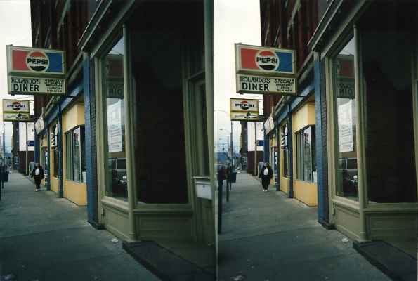
When we look at streetscapes in many contemporary East Asian cities we often see pictures of a forest of neon calligraphy, advertising this or that product or shop. In America, we see a similarly motorized version of this, as Robert Venturi so famously has described. These kinds of commercial streetscapes can be functional and still beautiful, since much depends on your subjective understanding of what constitutes a beautiful landscape. However, they contrast strikingly with Victorian commercial buildings, American Main Streets, or Italian gallerias of earlier eras for reasons that go beyond new materials, new construction methods, and new technological demands. There was more going on in these approach of building small shops. There was pride of ownership and individuality evident that is different than the pride of ownership we see in small businesses today, especially and obviously when they’re franchises. There were normative ideas about how to relate your building to others without government direction. Yet, today, too many planners and designers are finding it necessary to rigidly demand less inspired designs to achieve this lost sense of place that attaches to an area or neighborhood that is working individually but in concert with one another to beautify their street. Usually this is in response to blight, sometimes in response to long, windowless walls from modernists.

Personally, I prefer when there is a demanding public who, perhaps almost unconsciously pursues an infusion of a particular aesthetic or humanist appeal into mundane structures of everyday life. Many places still seem to engage in this effort to beautify effortlessly, without prodding from local boosters or government, but as a matter of course of doing business. Not surprisingly, I’ve encountered this taking place in self-styled fashion cities like Montreal. In the early 20th century, American cities were full of businessmen who were criticized for their vulgar displays of wealth by building ornate facades of eclectic styles on even the most ordinary buildings. Bakeries and banks alike felt compelled to make architectural statements. Today, some painted numbers inside a window suffices. There are many imaginative people amongst us who can find a charm to these sorts of scenes. However, the beauty in the public realm is really being left to individuals to perceive, and is not consciously made. This salumeria might have once unconsciously arranged meats in the window this way, but that was perhaps centuries ago, and there is definitely an artifice to these arrangements today ( no less lovely for being so ). The comparison to an average American meat market (those that survive I suppose) or the local bodega is obvious. Is it a matter of money, or a cultural difference in taste or panache? There are two trends in our supermarkets today, either to update the interiors to resemble cafes and high end food markets (like Wegmans, some Whole Foods, etc) or downgrade to Super Wal-mart, Costco warehousing. Some would argue the Wal-Mart model is on its way out after peaking, but their profits haven’t shown this–yet.
The more extreme among us (Americans, not British or Dutch) would try to rectify this lacking attention to visual appeal through city adopted design codes. I think there is some validity to discouraging or even outlawing things we know are deadening to the public realm (long, uninterrupted spells of wall facing a sidewalk or public street, , max. setbacks instead of minimum ones, for instance). But when it reaches the point of dictating what kind of eaves a building should have, we have perhaps gone too far. Admittedly, this is a fuzzy standard, and too much relies on what is ultimately just the considered opinion of experts (subject to constant change) and nothing further. What is it going to take to make everyday, vernacular architecture of things like gas stations, retail outlets, concession stands, etc to become more design conscious? Is it recognizing some hidden economic cost of ugliness, or is it just an awakening of values? Or am I missing something already around me?

